
肌理と気配-Textures
2012年7月28日(土)~9月17月(月) 10:00 - 18:00/無料
air2012-2ja
法貴信也
HOUKI Nobuya
《Untitled》、2012
110×500cm [2点組]
オイル転写、紙、布、油絵具、パステル
撮影:山本糾
線に拠る
近藤由紀
作品は、その全体的な構造や形や色彩のバランスが考慮されているのはもちろんのことだが、それと同等、あるいはそれ以上に、全体を構成する各細部に長い思考錯誤と深い思索の結果が込められ、その積み重ねが全体を作り上げている。特に絵画表現においては、そこに何が描かれているかということと同じくらい、その作者の筆の動きを感じさせる(あるいは感じさせない)筆致、絵具や顔料の質感、塗りの違いが生み出す色彩のバリエーションといった細部がしばしば重要になってくる。
軽やかな線描が特徴的な法貴信也の作品では、一見線が縦横無尽に、自由に踊っているようにみえる。しかしそれらは、絵画を構成する要素についての考察と実験の積み重ねから生まれた線である。表面を走る線は、ある形とある形が結びつく直前で、解体し、背景に消えてしまったり、かと思えばそのうちの一つが何かのキャラクターのようにみえたりする[fig.1]。ドローイングの濃淡と強弱はこれに一時的な遠近法を与えるが、それらは意図的に一貫しておらず、手前に見えた図像の一部がずっと奥に下がっているように見えたりすることで、絵画における空間のイリュージョンを肩すかしさせる。これらの線は濃淡や太さの複雑なバリエーションを持っているが、その一方でほとんど同じ調子で描かれているようにみえ、それが単純な筆圧や速度の差異によって生じたのではないことがわかる。それが全体に不思議な均質感を与えている。更に法貴はこうした線を生み出すために、キャンバス表面の下塗り、線を引く方法、筆の材質など事こまかに選択して描く。その細部にまで張り巡らされた意識が作品に独特の気配を与えている。
法貴はこれまでも線によって、絵画空間/表面について言及、分析する作品を描いてきた。近年続けている法貴が「二本画」と呼ぶペインティング――黒い線を二色に分離したと法貴が考えるえんじ色と紺色の二色/二本のペンを同時に持ち描く作品[i][fig.2] ――は、絵画空間のみならず、そこに描かれる線そのものについても言及した作品である。こうした現実の虚構ではない絵画独自の空間と平面を作ろうとする際に、法貴は描画のための独自の方法やルールを用いる。それは描かれる線が自身の身体の快楽に流されることのないよう、惰性の繰り返しに陥らぬように、厳重にコントロールしながら描いていくための手法でもある。それは法貴が自らの身体性を強く意識していること、そしてそれを受容し、時に否定するために導き出された手段であるようだ。
制作のために材料、前準備などに神経をとがらせて制作をする法貴にとって、制作の場は、多くの資料、試作された画材、その結果をおさめたファイルなどに囲まれた自らのアトリエが最良の場であろう。レジデンスでの滞在制作は、法貴にとって今回初めての試みであり、従ってその滞在制作の作品は、通常の絵画制作とは異なり、「実験的」な形式がとられた。
今回法貴が制作した作品は、オイル転写の作品である。当初滞在制作作品としてフロッタージュが試みられた。それは土地を写すということばかりではなく、版表現への関心、特に青森出身の板画家棟方志功の版画と版木が同時に展示されている様子から、作者の手による線と、転写されて変化した線の関係に関心を持ったことも一因であったという[ii]。その関心の所在は法貴のドローイングで描かれた作品を「ペインティング」にするという長きにわたる探求と結びついているのだろう。法貴は制作を行う上で、紙や布を選び、適した画材と画具を見つけ出すために多くの試作を重ね、転写された線の濃さ、写り具合、風合い、滑り具合などの細かい調整と文字通りの「実験」を行った。その結果、フロッタージュの案はオイル転写の線描作品という形をとることとなった。
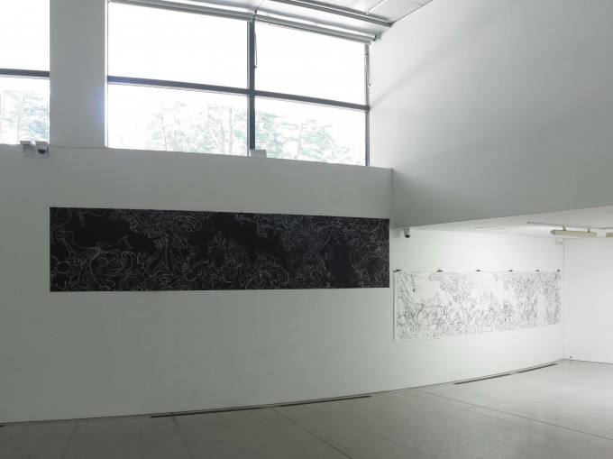
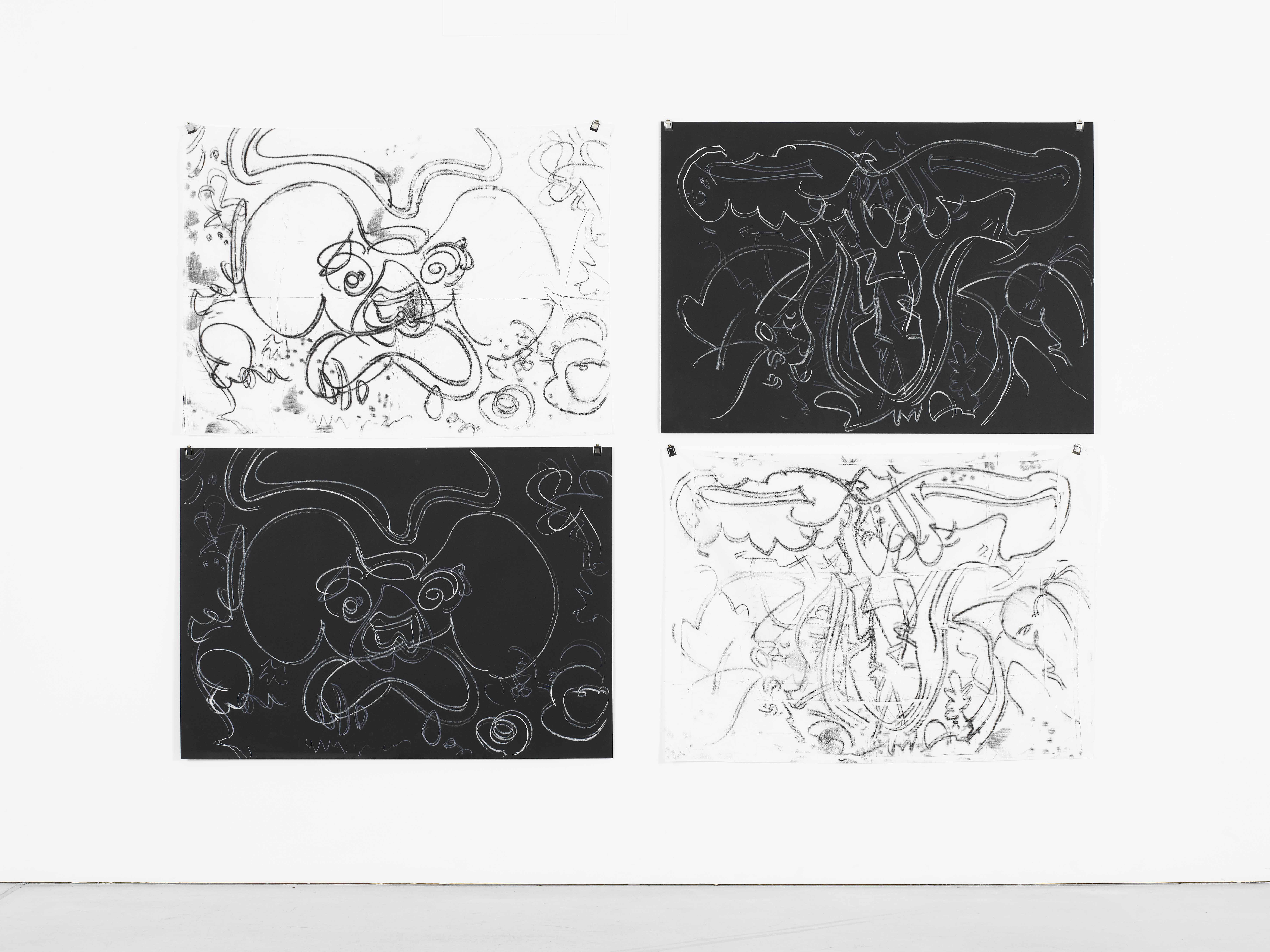
オイル転写作品の一つは黒紙の裏にワセリンを混ぜた油絵具を塗り、その上に手製の白いクレヨンで一気に線を描き、下に置いた白い布に線を転写させる作品である。約80×109cmほどの紙に描かれたオイル転写の作品は、法貴作品にしばしば現れる何かの形にみえるような、キャラクターに見えるようなモチーフを中心とした線作品である[fig.3]。同じオイル転写の作品で、110cm×500cmの横長の作品では、大きく三つの波形が画面全体に動きを与え[fig.4]、細部では小さい作品同様に何かにみえそうな形、何かのキャラクターに見えそうな形が小さな場面をいくつも作っているようにもみえる[fig.5]。それは図像や物語のない鳥獣戯画のように、場面をある程度分割しながら、右から左へあるいは左から右へとみる者の目線をリズミカルに誘導していく。長い画面は多視点であるばかりではなく、複数の画面が組み合わさっているような構図をしていながら、全体としては統一感を持つ日本画的な画面の構成方法が採用されている。この黒紙と白布に描かれている線は、線と地の色が反転していることで、その同異をも強調する。転写されているために描かれた線あるいは図像は同じであるはずだが、二つを比較してみると、黒紙の線は細部まで作者によってコントロールされていることから、リズミカルでバランスのいい強弱が画面に広がり、独特の奥行きを生んだり消したりしている。一方白い布に描かれた線は、転写による偶然が付与され、思いがけない部分が強調されたり、その逆があったりして、作者がコントロールして描いた線とは異なる表情、異なる強弱を持つ。これらの線は「思っていたより」(黒紙をオリジナルとしたら)荒々しく、けばけばしくみえ、それがバランスを若干崩し、全体に不穏な緊張感を与えている[fig.6]。それは作者の手によって描かれた線の質感が思いがけない変換をされていることに対するずれが生む奇妙な感覚からくるのかもしれない。
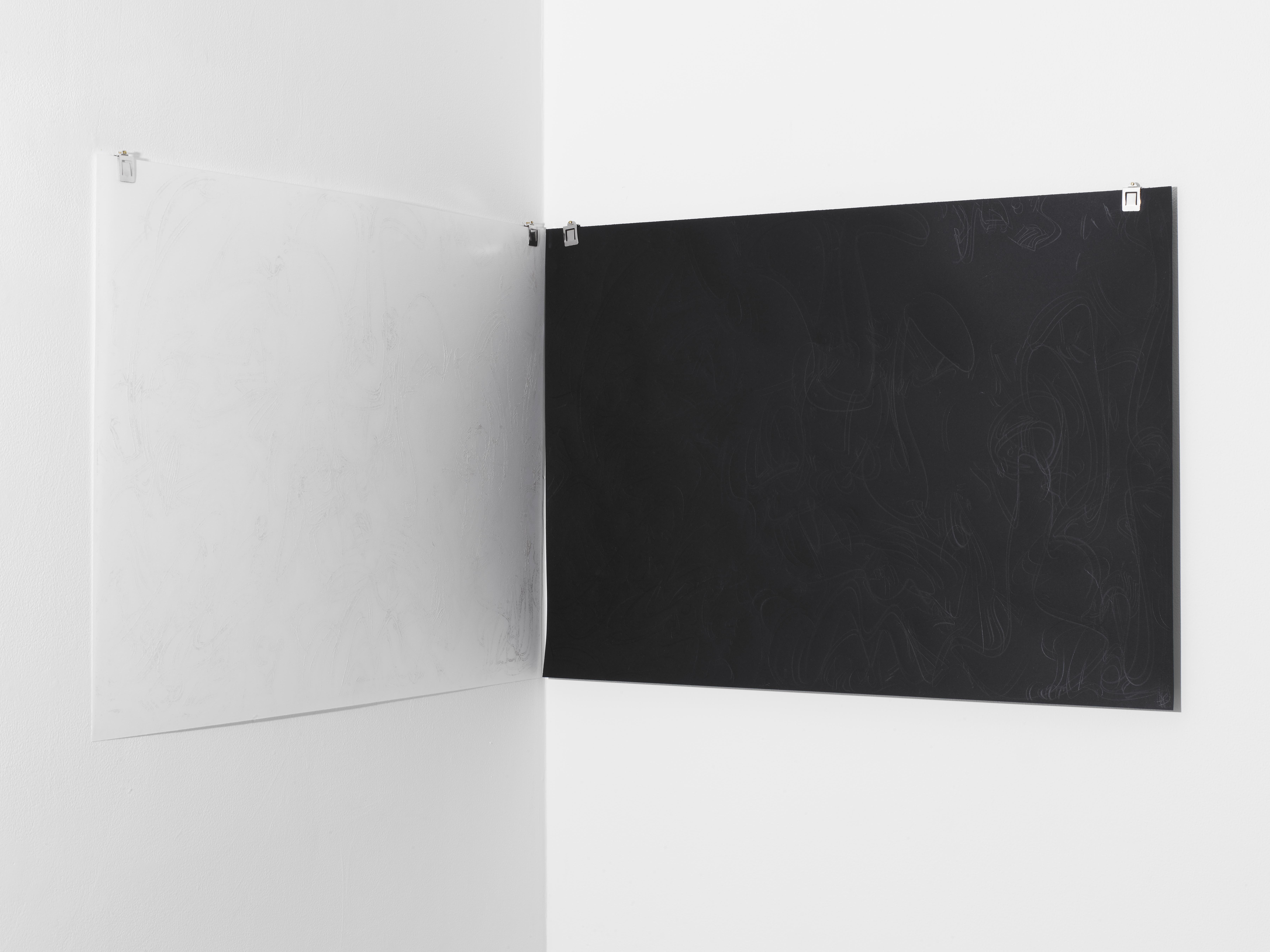
もう一つは同じオイル転写の作品であるが、黒紙に白いパール粉の入った絵具をぬり、そこに白い紙を重ね、黒紙の上から堅いものでひっかくようにして描かれた線が、白い紙へと転写されたものである。黒紙にはひっかき線が、白紙には白絵具で転写された線が載っているため、一見単なる白紙と黒紙が並んでいるだけのようにみえるし、近づいてもその図像の全体像を捉えるのは困難である[fig.7]。そこにはきらきらとした線の痕跡が残り香のように示されているだけである。それはまさに行為の痕跡である。描くことと描かれた線との有り様を探求してきた法貴だが、この作品においては線を見せないことでその行為性を特に強調しているように思われた。それはレジデンスという「制作すること」に重きを置くプログラムにおける制作発表ということと関係があるのではないだろうか。
法貴の作品には、絵画についての自己言及性、日本画の空間や画面構成の採用にみられる日本の近現代の画家としての歴史性、手触りや視覚といった身体的感覚の重視、手くせを含む描く行為とその結果としての画面を徹底的に掌握しようとする職人的ともいえる私的身体の抑制といった要素が面白い具合に混在しているようにみえる。とすれば、法貴にとって描かれた結果としてのペインティングのみならず、描くという行為そのものも重視されているといえるだろう。そこではドローイングはペインティングに従属するとは捉えられておらず、法貴がドローイングによって「ペインティング」を制作しようとするのは、この長きにわたるドローイングとペインティングの従属関係を逆転もしくは等価にするための試みともいえる。法貴が「実験」と言う転写の作品の試みは、法貴の身体性を持ちながら、同時に自律した線を獲得しようとする法貴が、偶然を利用してまで獲得しようと試みた線なのかもしれない。
[i] 地と図の色の反転版としての黄と白の二色や線の多色化の試みとして、別の色が採用される作品もある。
[ii] 7月28日展覧会オープニングにおけるアーティスト・トークでの発言。
***
滞在制作作品

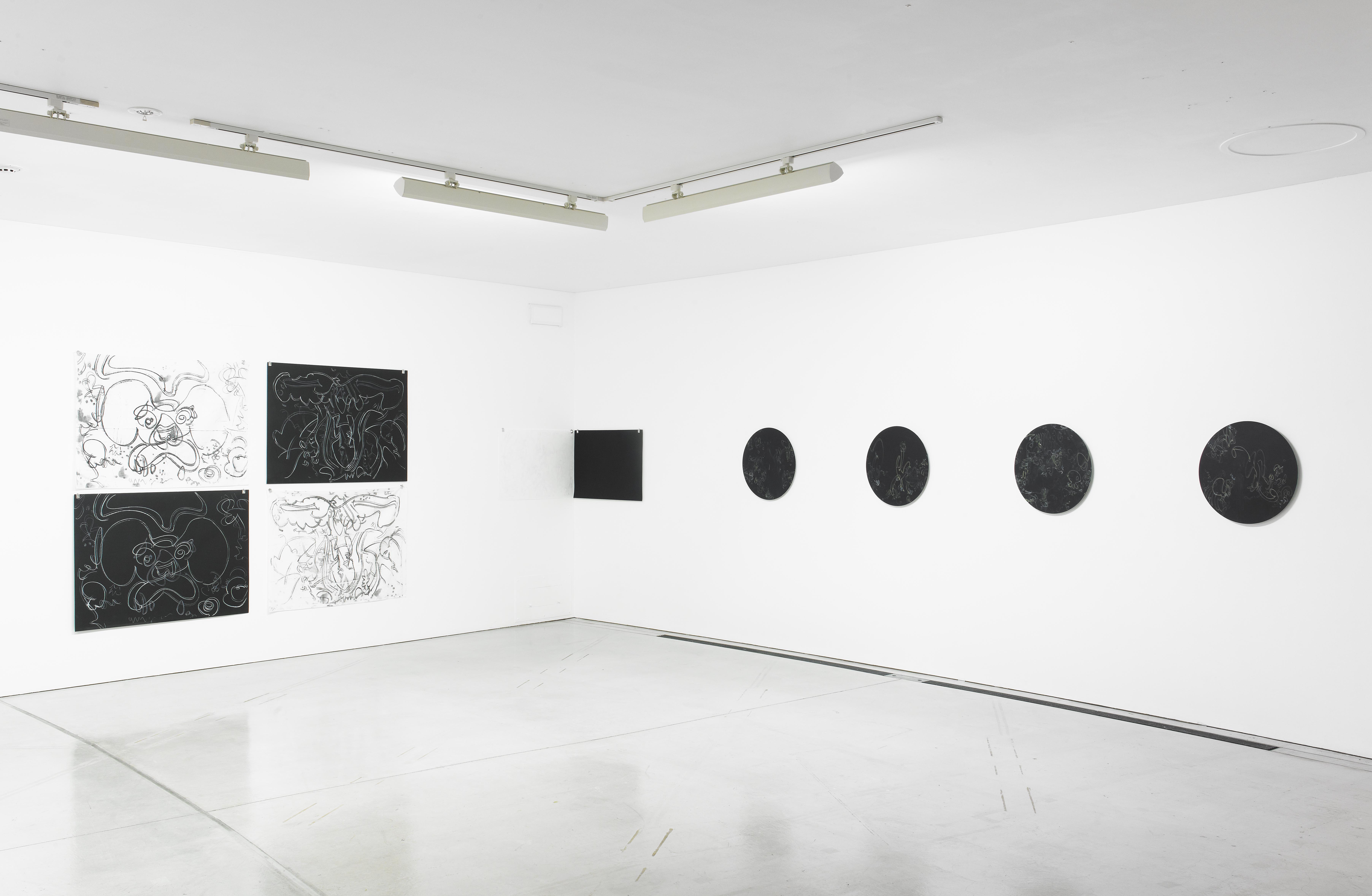 展示風景
展示風景
 左:《Untitled》、2012
各78.8×109.1cm [2点組]
オイル転写、紙、布、油絵具、パステル
右:《Untitled》、2012
各78.8×109.1cm [2点組]
オイル転写、紙、布、油絵具、パステル
 《Untitled》、2012
各54.5×78.8cm [2点組]
オイル転写、紙、油絵具、パステル
撮影はすべて山本糾
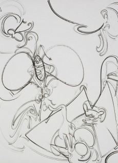
fig.1《Untitled》、2011
108x76.5cm、墨汁、紙
Courtesy of Taka Ishii Gallery
Photo: Yasushi Ichikawa
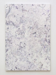
fig.2 《Untitled》、2012
194x131cm、油彩、キャンバス
Courtesy of Taka Ishii Gallery
Photo: Yasushi Ichikawa
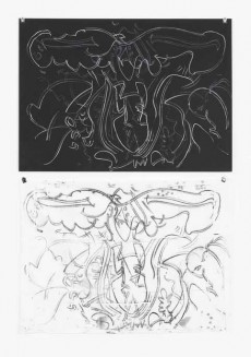
fig.3《Untitled》、2012
78.8x109.1cm、オイル転写、紙、布、油絵具、パステル
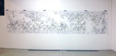
fig.4-1 《Untitled》、2012
110x500cm、オイル転写、紙、布、油絵具、パステル
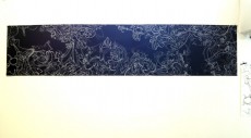
fig.4-2 《Untitled》、2012
110x500cm、オイル転写、紙、布、油絵具、パステル
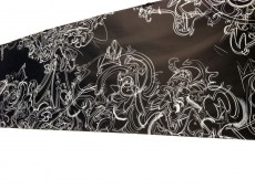
fig.5 《Untitled》部分
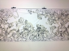
fig.6 《Untitled》部分
fig.7 《Untitled》部分
Textures (Kime to Kehai)
July 28 (Sat) ~ September 17 (Mon), 2012 10:00 - 18:00 / Free
HOUKI Nobuya
法貴信也
Untitled, 2012
110×500cm each [Set of 2]
Oil transfer, paper, fabric, oil, pastel
Photo: YAMAMOTO Tadasu
Based on Lines
KONDO Yuki
It goes without saying that artists are fully aware of the balance between the overall structure, shapes and colors in their works. Equivalently or more importantly, artists construct the whole piece after spending a long period of trial and error and days of deep contemplation for the details of different parts in the whole. Especially in pictorial representation, what artists often consider as important as the subject of the work are such details as their brushwork, which may or may not show the brush movement, the texture of paints and pigments, and color variation emerging from differences in coating.
In HOKI Nobuya’s works, which are characterized by rhythmical line drawing, lines seem to be dancing freely in all directions at first sight. Actually they are lines produced as a result of his inquiry into the structural elements of painting and the accumulation of his experiments. Lines running on the surface occasionally break up or disappear in the background just before certain shapes come to be combined, or you might think that one of them appears to be a certain character [fig.1]. Shading and strong/weak stresses of drawing temporarily provide a perspective, but they are not intentionally consistent. As a part of the image seen in the front looks as if drawn deeper into the back, the artist tries to eliminate the spatial illusion in painting. While these lines have complex variations of shade and thickness, they seem to have been drawn in a constant manner, and you can tell that such variations are not caused by mere difference in strength of brushstrokes or speed. That is why his overall work has mysterious homogeneity. Furthermore, he is meticulous about undercoating the canvas surface, methods of drawing lines, and choosing brush materials. His meticulous attention shown in the details all over the picture gives his work distinctive atmosphere.
So far Hoki has produced works, which refer to and analyze the pictorial space/surface. The painting, which he has been working on recently and calls “double line drawing (NIHON-Ga),” refers not only to pictorial space but also the very lines drawn there. The double line drawing is done with two pens, which he uses together at the same time, in two colors (wine red and navy blue), which he considers to be colors composing black[1] [fig.2]. The attempt to create space and plane surface unique to painting, which is not a figment of reality, and to refer to the elements that make up “painting” seem modernistic at a glance. On the other hand, however, his own drawing method and rules are strictly controlled so that he would neither be overwhelmed by his physical pleasure in drawing lines, nor would he merely work from force of habit. His method reflects his awareness of his physicality, and the method seems to be derived for him to accept that physicality or deny it accordingly.
As he is exquisitely sensitive about materials and preparation for production, the best place for him to create is his studio surrounded by many materials, art supplies used for experiments, and files that contain all results. As he participated in a residency program for the first time, his work produced during his stay was different from paintings that he usually produces, and an “experimental” form was adopted.
This time he made oil transfer drawing, but at first, he tried frottage. He was not only interested in reflecting the locality, but also wanted to learn more about representation with woodblock prints, showing interest in a relationship between printed, transformed lines and lines directly chiseled by Aomori-born woodblock print artist MUNAKATA Shiko (his works and printing blocks were displayed during the exhibition period)[2]. Hoki’s interest is related to his many years’ pursuit of transforming his line drawings into painting. In the process of production, he tried out many pre-production prototypes in order to find most appropriate paper, cloth, painting materials and tools, actually experimenting on detailed adjustments to the thickness of traced lines, quality of printed image, texture and conditions of rubbing. Consequently, the plan of frottage was changed to oil transfer drawing.
For one of his oil transfer works, oil paint mixed with Vaseline was painted on the back of black paper, on which he drew lines without a pause, with a handmade white crayon, and the lines were copied on white cloth underneath. This piece of oil transfer drawing on about 80x109cm paper is a line drawing with the focus on a motif, some form that often appears in Hoki’s works that reminds us of a certain character [fig.3]. In another 110x500cm oblong oil transfer drawing, three large waveforms give a movement to the entire picture [fig.4], and in the details are many small scenes seemingly representing shapes, which are likely to form something or look like certain characters as in his small works [fig.5]. Splitting scenes to some extent, those shapes lead viewers’ eyes rhythmically from right to left or from left to right like scrolls of frolicking animals without icons and stories. While having multi-viewing points and being composed of plural scenes combined, this long piece adopts the picture configuration of Japanese painting with a sense of unity as a whole. As for lines drawn on the black paper and white cloth, the colors of lines and those of the background are reversed, and this reversal highlights similarities and differences between the two. Since they are transferred, drawn lines and images ought to be the same, but when the two are compared, lines on the black paper, which are controlled by the artist to the last detail, are well-balanced and rhythmic in strength, turning on and off the unique depth of the whole picture. Lines drawn on the white cloth, on the other hand, are attributed to chance with unexpected part strengthened or weakened, and show different looks and dynamics than those controlled by the artist. These lines appear to be more wild and flashy “than expected” (compared with the original black paper), which upsets the balance slightly and gives a disturbing tension to the picture as a whole [fig.6]. _e tension may come from a strange feeling caused by the difference between the texture of the lines depicted by the artist and that of converted lines, the outcome of which is unpredictable.
In another work, which is also oil transfer drawing, white paint mixed with pearl powder is painted on a piece of black paper, and a white paper is placed on it. Lines on the black paper are scratched with a hard object to be transferred on the white paper. Since there are only scratched lines on the black paper while white, copied lines are left on the white paper, they look as if they are plain white and black sheets of paper put side by side. Even looked at closely, it is hard to capture the whole image [fig.7]. Only sparkling traces of lines are shown there like lingering fragrance. It is the very vestige of an act. It seems that Hoki, who has pursued how the act of drawing and drawn lines should be, tried to emphasize the act even more by not showing lines in the work. I don’t think that this is unrelated to the fact that his work is presented in a residency project in which emphasis is placed on the “act of creation.”
In his works, various elements are interestingly mixed, for example, self-reference about painting, historical aspect as a contemporary Japanese artist as shown in his adoption of the spatial and pictorial composition of Japanese painting, emphasis on physical senses such as touch and sight, the act of drawing including habits of hands, and consequent personal control of physical function (similar to the artisan attitude) so as to have a thorough command of the picture. Then, you might say that he considers very important not only painting as a result of his drawing but also his act of drawing itself. _ere, drawing is not regarded as subordinate to painting, or rather, he attempts to create “painting” through drawing, because he wants to turn over the long-lasting superior/subordinate relationship or at least make them equivalent. As he has been keen on achieving lines with his physical attributes and yet with autonomy, transfer drawings that he tries and calls “experiment” consist of lines, which he might have attempted to acquire even by chance.
Translated by NISHIZAWA Miki
[1] In an edition having the background and lines in reversal, two colors (yellow and white) are sometimes used. Other colors are also used in a trial to apply multiple colors.
[2] He mentioned such interest at the artist talk on July 28, 2012, the opening day of the exhibition.
***
The Works produced in ACAC.
Exhibition view
Left: Untitled, 2012
78.8×109.1cm each [set of 2]
Oil transfer, Paper, Fabric, Oil, Pastel
Right: Untitled, 2012
78.8×109.1cm each [set of 2]
Oil transfer, Paper, Fabric, Oil, Pastel
Untitled, 2012
54.5×78.8cm each [set of 2]
Oil transfer, Paper, Fabric, Oil, Pastel
All photos: YAMAMOTO Tadasu
fig.1 Untitled, 2011
108x76.5cm, Indian ink on paper
Courtesy of Taka Ishii Gallery
Photo: Yasushi Ichikawa
fig.2 Untitled, 2012
194x131cm, Oil on canvas
Courtesy of Taka Ishii Gallery
Photo: Yasushi Ichikawa
fig.3 Untitled, 2012
78.8x109.1cm, Oil transfer, paper, fabric, oil, pastel
fig.4-1 Untitled, 2012
110x500cm, Oil transfer, paper, fabric, oil, pastel
fig.4-2 Untitled, 2012
110x500cm, Oil transfer, paper, fabric, oil, pastel
fig.5 Untitled, detail.
fig.6 Untitled, detail.
fig.7 Untitled, detail.