
Storyteller – Units of Recognition
November 3 (Sat) ~ December 16 (Sun), 2012 10:00 - 18:00 / Free
Lotte LYON
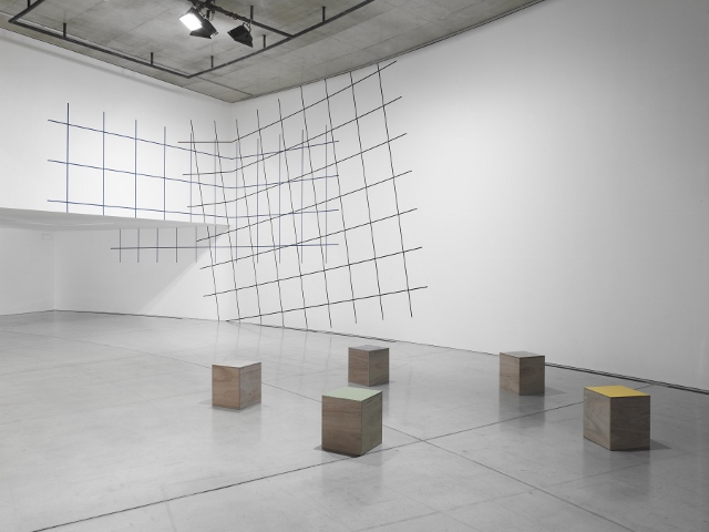
Installation view
Blank Sculpture Affecting One’s Behavior
HATTORI Hiroyuki
Lotte LYON has no fear of a blank. Or rather, by producing a fascinating blank in a positive manner in a space of any size in any situation, she can transform all aspects of space through an act that seems to be the best minimum. As MATSUI Midori has already made a clear and critical analysis of every aspect of Lyon’s works [1], I would like to focus, in this article, on the process and finished pieces of her creation during her three-month stay in Aomori and her works displayed at her solo exhibition held simultaneously at a commercial gallery called Aoyama|Meguro in Tokyo. I study Lyon’s sculpture and pursuit of space, referring to the relationship between the two.
Lyon produced three types of works: wall painting, boxes, and a set of monochrome photographs. According to her, there is no obvious relationship among those three pieces made in different forms respectively. Each output is certainly different, but a blank produced in each piece through her modest means tells us a great deal. You might call it a sculptural space giving form to absence.
Probably few people have noticed that exhibitions held at ACAC and Aoyama|Meguro are closely related. After all, since Aomori and Tokyo are far apart, I think few people visited both exhibitions. If you only compared the two, Lyon’s characteristics would clearly show up. At ACAC, a visitor can enjoy the outside view from a large window at the top of the exhibition hall and there pours in natural light. It is a huge white space made specifically for exhibitions, though it is not exactly a simple white cube. On the contrary, Aoyama|Meguro is a commercial gallery with space for the purpose of both an exhibition and a retail store. The space is shared with an architect’s office and a shop, and due to its unusual arrangement, other irrelevant activities are visible in the back of the exhibition space. This is also a white space with a unique feature. While ACAC is a vast space with about 6m ceiling and 65m length, Aoyama|Meguro is an irregular space of 20~30 square meters. The two are contrasting in both size and shape, but they share a common feature. Neither of them is a pure white cube, and there is moderate noise in either space. Lyon does an excellent job making the best use of spatial elements that are generally considered negative in such a peculiar place, which looks inappropriate for exhibitions at first glance. Intervening in those totally different venues, she adopted an approach in common by producing wall paintings with the grid pattern and adding photo works beside them. Then there emerged an atmosphere common to both places notwithstanding that they were in distinct contrast.
First, let me introduce her works produced at ACAC. Using two colors of dark blue and dark brown, she painted grid patterns partially overlapping with each other on two wall surfaces―one was a curved wall and the other intersecting wall was suspended at about 3 meters height from the ground. (fig.1) In the back of the suspended wall was a recess large enough to display works, but Lyon kept the space empty and all she did was lighting it. (fig.2) Adopting the minimum approach, she boldly made a space of absence and created amazing depth there. Though nothing substantial as a piece of artwork was in the back, there was an overwhelming presence of absence. It was like the interior of the Japanese sukiya-style building where there is almost nothing except an amazing spatial expanse. Consequently, the wall painting in the front emerged all the more vividly. Moreover, grid patterns painted in cold colors went perfectly with the lonely scene outside the side window in the back, which varied as the season changed from November to December. Additionally, two partially overlapping grid patterns increased the complexity because they met with each other on two wall surfaces, curved and suspended. Looking closely at the grid pattern painted obliquely on the curved wall, we experienced a strange sensation that our sense of balance was shaken in mixed-up perspective. Even when we stepped backward to have a look at the whole, we still felt a strange feeling like floating. The impression of the scale also depended on where we were looking at the work─either we felt as if standing in the midst of a vast space or everything seemed to be within easy reach. Using the minimum elements and acts, she provides us with the opportunity to experience mixed feelings of comfort and discomfort that seem to paralyze our senses. What she presents is a spatial experience that appeals to our physical feelings.
In the foreground were five objects, which looked like chairs. (fig.3) They were simply made: a box was made of typical 12mm-thick plywood and the top plate was fastened with hinges. Some top plates were colored with paint and the others were unpainted. When the painted top plate was lifted, there was nothing inside. Opening the lid of the box with an unpainted top plate, you could see the inside painted. They were made as a pair with the same form but the presence and absence of color were reversed. Using small means of devising, Lyon arouses viewers’ curiosity and encourages them to react in some way. From its size, this 3-D object looked no more than a simple chair. As hinges are used to fasten the box and the top plate, viewers are invited to lift the top plate. When they open it, they see nothing inside except that there is colorful emptiness. She produces various contrasting relationships through minor devices, and gives form to absence using only colors and blanks.
The last piece is a set of six black-and-white photographs put up on the wall. (fig.4) It shows various compositions made by combining mattresses and chairs, and the relationship between the arranged objects is unusual. The photographic contrast is weakened as much as possible. While emphasizing the gradation width of gray, she was careful not to make them appear too dramatic. The feature of her work is to construct a sculpture purposely in a simple way and to use familiar materials as well. She absolutely denies what sculpture normally has: materiality, an aura of solidity and presence. Exploring how she can make it lightly, or how she can exceed the fundamental nature of sculpture such as a feeling of solidity inherent in sculpture, she takes on the activity of producing sculpture. She uses common materials, produces pieces that are not lasting and easily broken, in order to show that absence and emptiness can be accomplished as sculpture. She presents even her photo works as sculpture dealing with blank space.
At Aoyama|Meguro, in contrast to ACAC, she painted the grid pattern in vivid red on the separated front and side walls. (fig.5) At ACAC’s vast space, she used cold colors, but at this venue where there is a noisy atmosphere of a multitenant building, she performed wall painting in warm colors on the main walls, and on the other limited wall, she arranged black-and-white photographs. At ACAC, she painted lines relatively uniform and thin, having the slanted grid pattern and the horizontal grid pattern meet with each other. Consequently, the space appeared to be stretching out and more complex thus confusing physical senses of the viewer. At Aoyama│Meguro, she used two kinds of lines, thick and thin, in vivid red, so that the grid pattern itself dominated the space with its presence. She left other parts than the walls blank. As there is a totally different space deep in the back behind the two walls, it is usually difficult to recognize the space as one room. However, by performing wall painting over two separated walls, she could successfully stimulate viewers’ imagination to perceive it as an integrated space.
Her performance of contrasting wall paintings between the two different spaces was very impressive. Though the method that she employed is almost identical, experiences of viewers are extremely different. At ACAC, by giving the wall painting a limited part of space and leaving the most part nearly blank, even the empty space in the back was realized as sculptural space. At the other venue, on the other hand, the front and back areas were divided by the grid patterns, and the entire surface painted with the grid patterns appeared to have a presence of a substantial sculpture, making it a high-density space. Lyon accomplishes her task of producing sculptural space by stimulating viewers’ imagination.
As mentioned above, Lyon creates sculpture out of blank itself by scraping off structural elements. Whenever I look at the emptiness illuminated by a number of fluorescent lights, Roland BARTHES’ words “the center is empty” arise on my mind, and I cannot but think about the relationship between Lyon’s blank sculpture and Japanese way of using space that affects our behavior.
[1] MATSUI Midori, “Between Objective and Human Domain: Lotte Lyon’s Gestural Minimalism”, Ensemble, Bibliothek der Provinz, Austria, 2010.
[2] Roland BARTHES, “Center-City, Empty Center,” in: Empire of Signs, Chikuma Gakugei Bunko, Tokyo, p.54, 1996.
Translated by NISHIZAWA Miki
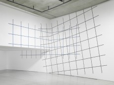
Untitled (wall drawing)
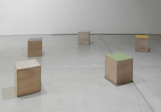
Untitled (five boxes)
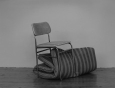
Untitled (series of six B&W prints)(part)
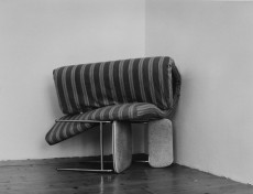
Untitled (series of six B&W prints)(part)
